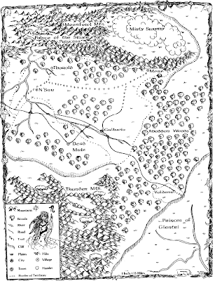
Get your own copy, some brief but neat background notes for it and the whole nifty module it goes with here.
Exploring Dark Visions and Tower of Six for Shadow Dark
-
Hello, Dear Readers! I decided to review something that has been sitting on
my shelf for a couple of months, almost a year at this point. It is Dark
Visio...


.JPG)


.png)


.gif)


It's a nice map, but it was a weird module to run for my first try as a Labyrinth Lord.
ReplyDeleteI love that map, and I kind of really like the original version PotSP that it comes from - even a bit more than the "fixed" Moldvay version (heresy). The setting of the adventure feels more like "dark fairy tale" than anything else, which gives it a different feel from the Sword and Sorcery or the Epic Fantasy stuff that TSR tended to publish for D&D. The actual dungeon crawl portion is kind of meh - but then I've always felt that the lower level of PotSP was kind of meh, even in the somewhat better Moldvay version of the adventure (the upper level in the Moldvay version is pretty good, IIRC, but the lower dungeon is just kind of boring). But the wilderness area, for all of its oddities, feels like twisted fairy tale, and I like that a lot.
ReplyDeleteI gotta agree with Jer that, ultimately, the original "flawed" Wells version is just better than the Moldvay version. Or perhaps I should say that both authors seem to have been given a premise, and wrote different adventures based on that, and I vastly prefer Wells' ideas.
ReplyDeleteI popped in here to say that I prefer the Wells version, only to discover everyone else saying the same thing! :)
ReplyDeleteMoldvay's version is certainly more polished -- and it's also a module that I played extensively when I first got into the hobby, so I'm hardly going to slight it.
And Wells' version could certainly use a little more polish. (And I never liked the B1-style of a half-completed module.)
But the ideas Wells was playing with were just fresher than what Moldvay gave us. As Jer says, the "twisted fairy tale" aspect of the module is really interesting. Wells also had far more dynamic and interesting NPCs (whereas Moldvay's rewrite puts everything in far more black-and-white terms). And Wells was also giving us a very classic D&D structure -- an expandable dungeon (with the implication that it was a megadungeon); the seeds for an interesting overland area; and so forth.
I've often said the single best example of the shift in adventure design that occured with TSR (and D&D in general) in the early 80's is to put the two versions of Palace of the Silver Princess next to each other. The orange version epitomizes the old and the green version epitomizes the newer.
ReplyDeleteOld: messy, open ended, holes to fill, little explanation, massively creative, endlessly playable.
New: clean, closed, ready to play, over-explained, underwhelming, played once and put away.
Oddly, aside from the green version of PotSP, Moldvay's stuff was entirely of the first category instead of the second and among my favorite rpg products ever produced.
Obviously, I too, prefer the orange to the green.
I'm reading through the Book of Weird right now, and it occurs to me that this map and the orange cover version of PotSP would be the perfect foundation for a more fairy-tale-esque D&D game.
ReplyDeleteSomewhere between the Wells free for all and the Moldvay do-over is the perfect version of B3. I really hate "non-niche" monsters that seem to exist only for the purpose of being kooky (the Decapus and Ubue fall into this category for me); however, I'll agree with the sentiment here that the Wells version is more in the "spirit" of basic D&D. I'd love to whip up a redo that incorporates the best of both worlds...
ReplyDelete