Nearly everybody being judged today did their best to tell me how they were really not a professional game artists, but the fact remains that their work was published somewhere prior to the contest. I created a separate category for these folks to avoid scaring doodlers away from entering the competition, but that really worried some of the entrants here. What can you do? Anyway, check these out.
Doc Rotwang!, who totally needs to update his blog, got a laugh out of me here by riffing on Raggi's weird choice of picking a header font with old fashion long s.
Craig Brasco's work here is technically good and I'm as fond of hot dark-haired sorceresses as the next het dude, but from an art direction point of view I just don't see the connection between the text and the illo. Great pic, but I wouldn't put it on this particular page.
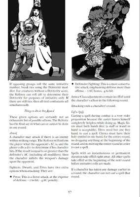
This submission from Wille Ruotsalainen leaves me doubly frustrated. I want to see the whole illo free of the text and I sure as hell want the text without the illo under it.
Here's another one from Wille. I like both pics. Fantasy RPGs need both more princesses in pointy hats and more samurai throwing down with bigass apes. And I love the choice of a swan on the tabard of the fallen knight. The discarded helm is a nice touch as well. The only thing I don't like is that there are two separate illos side-by-side. If I was the publisher and Wille was hired for art on this page I'd want a redo combining the two pictures.
I love, love, love Jennifer Weigel's pic bugs crawling all over this page. They remind me of this old Homestar Runner cartoon. But I hate, hate, hate the idea of covering up the text.
This other Jennifer Weigel illo is just about the best thing ever. It nicely illustrates one of the spells on the page as well as winking towards Call of Cthulhu. Cutesifying Cthulhu has gotten really played out in the last decade or so, but Jennifer brings a freshness to the subject that I find irresistible. And that's why she gets the blue ribbon for this category.
Congratulations Jennifer! Send me an email with your mailing address and your choice of whether you want the Minibox of Mystery or the Preposterous Miscellaneous as your prize.


.jpg)


.JPG)


.png)


.gif)


Well done Jennifer. The bugs are superb, and I love the way they block out the text. It seems to put the text in its place relative to the kind of creation it aims to support.
ReplyDeleteWe'd see more of Wille's illustration too, and have less text lost, if there weren't so many words on that page. Why so many? It's not as if the audience for LOtFP, or any similar product, would be unable to get the gist or fill in any blanks, or hadn't read similar before.
Didn't someone recently run a contest to reduce spell descriptions? If not, there's a good starting point for a general reduction in content quantity and repetition across materials. To take account of Zak's recent comment on baroquing things up, brevity doesn't preclude weight.
Ohhhh, the swan is on the knight's tabard! I was sitting here like a dope wondering why the princess was trying to give him a rubber ducky...
ReplyDeleteSamurai v. ape is rad. As is Tele-Cthulhu.
Congratulations Jennifer :-D
ReplyDeleteYour illustration reminds me of "Cthulu Saves the World" and "Hey there Cthulu"
http://www.youtube.com/watch?v=XxScTbIUvoA
Good job!
This comment has been removed by the author.
ReplyDeleteBy the way: yes the intent was to point at the metafictional nature of RPGs, and if someone feels like having a short adventure, retroclone or supplement illustrated using that style, I would love to do it, just drop me a line. I'm interested on quality of content, not money, so don't be shy ;-D If i like the text I wont charge you (unless it's intended for sale).
ReplyDeleteWow, I am totally flattered. Thank you so very much Jeff. I am honored to be chosen from such great company and, although I didn't see myself in any other grouping than "professional", I recognize that my art practice is unconventional at best... ;)
ReplyDeleteFelipe, I love your metaphysical approach; it really beautifully blurs the distinction between reader and written content. And Wille, your dynamic compositions are great. Craig, your work is exquisitely rendered and deserves to be elevated to cover art. But most of all, I totally think that the fantasy world needs more forklifts... it totally makes me think of the warehouse in Indiana Jones. :)
Again, thank you and I will be in contact (perhaps after consulting the stars...). ;D
Jeff, what kind of picture do you think would have gone with choosing a name?
ReplyDeleteOff the top of my head: A collage of the same person dressed as a viking, a knight, a samurai, etc.
DeleteGot to love that dorky expression on Weigel's Cthulhu. "Hullo! Oh my, this indeed is the residence of the star-gods, this is Albert Cthulthu on the phone."
ReplyDeleteI really like Wille's work too, I mean with name like lamentations of the flame princess you would expect more princesses in pointy hats.