The cover to The Palace of Ontoncle interests me, however. The artist is Matthew Quayle, I believe, and his work here does what I really like to see with site-based adventure modules: put the adventure locale front and center. That big sprawly castle with the threat of monstery doom looming over it is exactly the thing I want to see on the cover of a module.
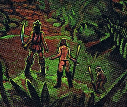
The other thing I like about this sort of cover is that the artist often sneaks in an adventuring party approaching the adventure site. Because the location itself is the focus of the piece, these figures are often smaller and less detailed. The abstraction of the figures actually helps make it easier for players to imagine themselves as the adventurers approaching this exciting place. Scott McCloud talks about this effect a bit in Understanding Comics.
 |
| My conclusion: successful RPG art doesn't need specific characters so much as broad archetypes that the players can take up. |
So we have three party members here. Dude with scimitary sword, leather armor (or maybe just a tunic), and a stupid-looking hat/helmet. Nearly naked sorceress type. And a third character that is maybe supposed to be a dwarf or halfling, but that looks more like a monkey to me. Are monkeys a playable race in DragonQuest? Overall, this trio is not a supergreat example of "you can play these people" figures. The fighter or thief type guy looks dumb, the demihuman is dubious, and I don't think I've ever met a gamer gal who wanted to play a naked wizard lady. (Though the female figure obviously has some cheesecake function. I must admit "hey is that chick naked?" was one of the first thoughts I had looking at this cover close up.)
Here's the classic example of this kind of gaming art, the Erol Otus back cover of B2 The Keep on the Borderlands.
Aw, yeah, dig those great Otus colors. The sun rises on the dawn of a new day just as this adventure serves as the beginning of a promising adventuring career. Now let's zoom in on the bottom right corner:
Let's look at some other, less clear-cut examples:
White Doom Mountain is the Hackmaster 4th edition version of the AD&D classic White Plume Mountain. The eponymous volcano is the main feature of the cover by William Church, but the party is seen in the bottom third of the cover.
I like that the generic fighter here carries a backpack, even if it is the smallest such item I've ever seen in a D&D illo. It's only one step up from a fanny pack, for crying out loud. But at least it's something. Blonde Sonja didn't bother to bring so much as a scabbard for her blade. She's clearly cheesecake, but unlike the topless witch above, I've known a few female players to go for this kind of character. And why does that wizard not have a beard? That's just embarrassing, man. I like the presence of the pixie-fairy PC, as that helps communicate something about how this game is different from D&D. Still the overall effect is that these characters are a specific party, rather than stand-ins for your party.
Making this party larger in the foreground does achieve the effect of allowing the viewer to imagine themselves as the fifth member of the party, just a few steps behind the rest of the group. That ain't bad.
Here's another SPI product, cover by Redmond Simonsen, I think. This is a D&D-like boardgame. I've never played it but it was written by Greg Costikyan, who is no slouch at game design.
Finding the PCs already in the dungeon and emphasizing the architecture of the labyrinth itself is its own subgenre here. For other examples see the covers to the dungeon geomorphs from TSR and Goodman Games, as well as the Otus cover for the Dungeon Masters Adventure Log. (In fact, this sort of gaming art probably deserves its own post.)
Anyway, let's look at the party in the DeathMaze:
Two characters are facing away from the viewer, as with most of the figures in The Palace of Ontoncle and White Doom Mountain. This helps depersonalize the characters and makes it easier to fill in the figure with your own PCs identity. The pantless warrior is a pretty generic fight guy, with ax, mail, and shield. His lack of leg covering is his only distinguishing trait. (Activity time: check the character sheet of the last fighter you played. Is 'pants' written anywhere in the equipment list?) The guy with the spear has some pretty distinctive renaissance-style dress, with a sweet cape and poofy sleeves and presumably stupid hat. The spear seems wildly out of place with the outfit, which is why they go together perfectly in the mishmash that is stock vanilla fantasy. The buxom lady with the rapier is fully clothed for a change, though the superhero spandex cheat is in full effect and her outfit is painted on. It could be grey cloth or skintight chainmail like Morgan Ironwolf wears. Unlike her compatriots, she seems more designed more to be looked at than imagined into, though to a less egregious extent than the woman on the Ontoncle cover.
Anyone else have any good examples of covers with adventure architecture featured prominently, but a party also present?


.jpeg)


.JPG)


.png)


.gif)


No comments:
Post a Comment